

ANCIENT HARVEST
From the high plains of Bolivia to the majestic mountains of Boulder, Colorado, the Ancient Harvest brand has a long history with quinoa. In 1983 Ancient Harvest walked the very first bag of this “supergrain of the future” into a Boulder food store. Today, Ancient Harvest is the premier brand serving up great tasting non-GMO, organic, gluten-free quinoa and innovative ancient grain products.
ROLE:
ART DIRECTOR | DESIGNER | PHOTOGRAPHER | ACCOUNT MANAGER
PROJECTS:
Re-Brand
Logo
Brand Identity
Brand Standards
Packaging Design
Bilingual Packaging
New Product Development
Front-End Website Design
Print & Digital Ads
Sales & Marketing Collateral
Apparel
Tradeshow Booth
Product Photography
Photo Editing
CHALLENGE:
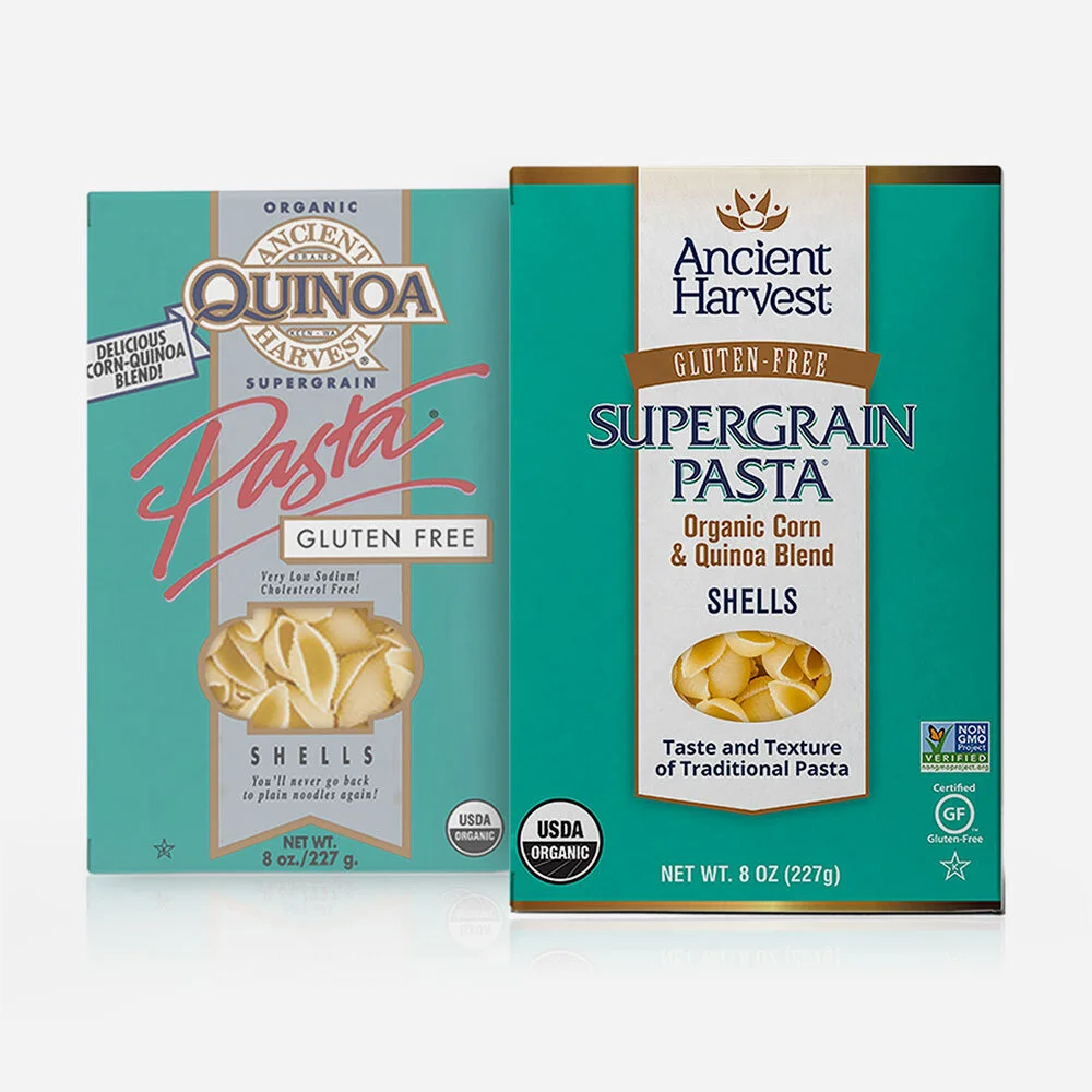
Ancient Harvest needed to revitalize their brand identity and packaging without confusing consumers and losing their long standing position in the pasta category. The biggest focus was on the brand name, it was lost in the packaging and needed to be reintroduced with a new, fresh look. The new system needed to accommodate new product development as the company grew. The single requirement: keep the teal!
SOLUTION:
This re-brand needed to be slow and strategic to maintain familiarity and we needed to allow for the ability to push forward into more exciting designs to accommodate future growth both in category and brand personality. The original package was busy, it was hard to find essential call outs, specifically the brand name. A new communication structure was desperately needed. We started by defining the most important communication points that reflected the needs of their consumers as well as their brand values. Ancient Harvest wanted to share their long history and their connection to the sourcing of their quinoa, Bolivia. A new logo and the use of old world typography on the packaging was used to help bring a historic and timeless feel to the brand, a nod to their long standing presence. We began focusing on appetite appeal through strong photography and providing IRL uses of the product. Ultimately the brand recognition, standards, and voice were strengthened and the packaging was simplified while maintaining brand familiarity and set the foundation for future design evolution.
Re-Brand

Re-Branded Packaging

New Product Development

Front-End Website Design

Print Ad

Collateral

Logo

Brand Identity

Apparel

Tradeshow Booths